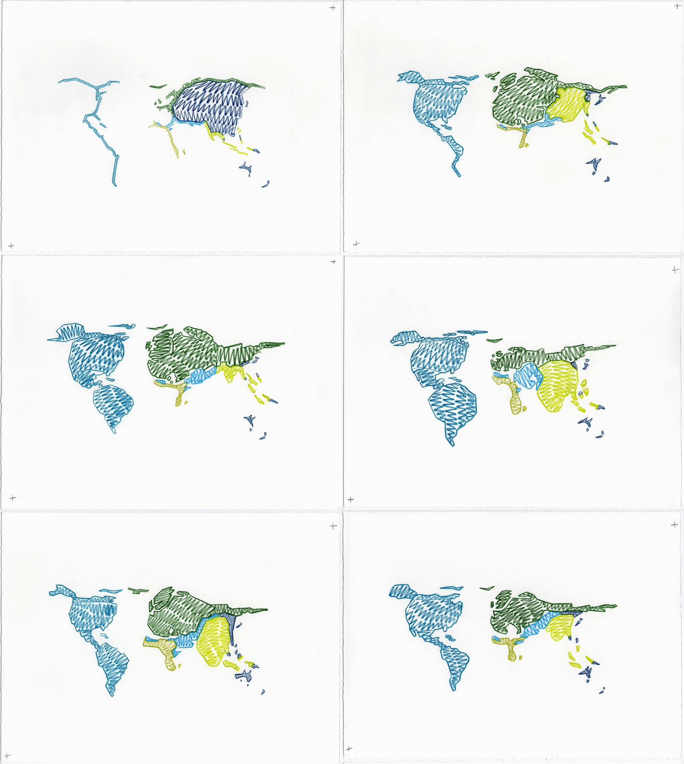
COVID19 & Data Visualisation
COVID19 storytelling through data visualisation
with a data humanism approach.
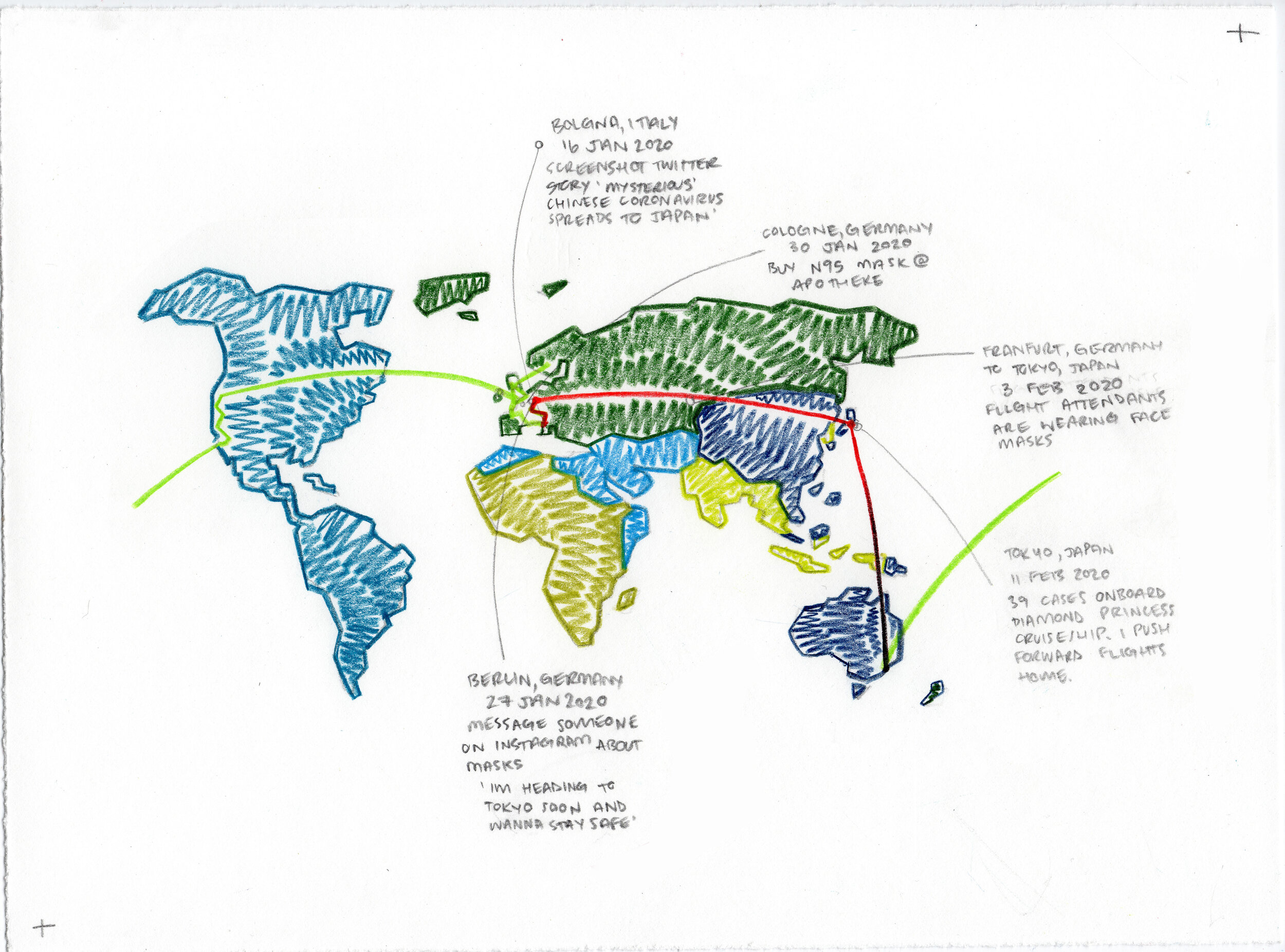

January 2020
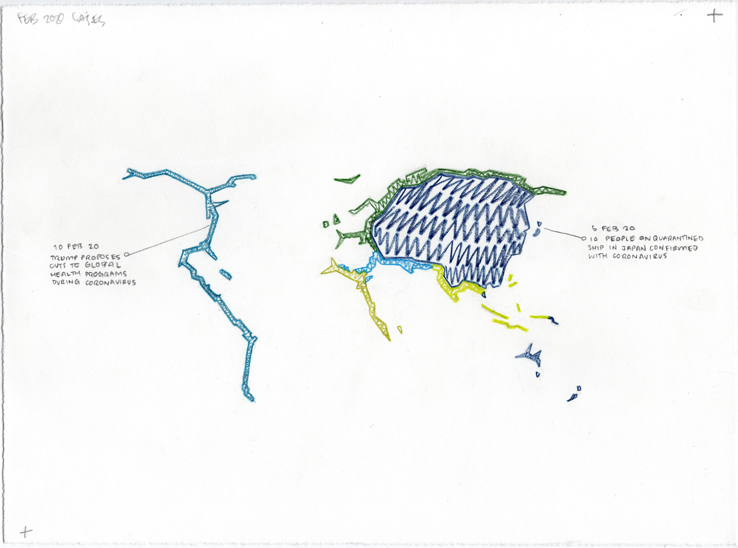
February 2020
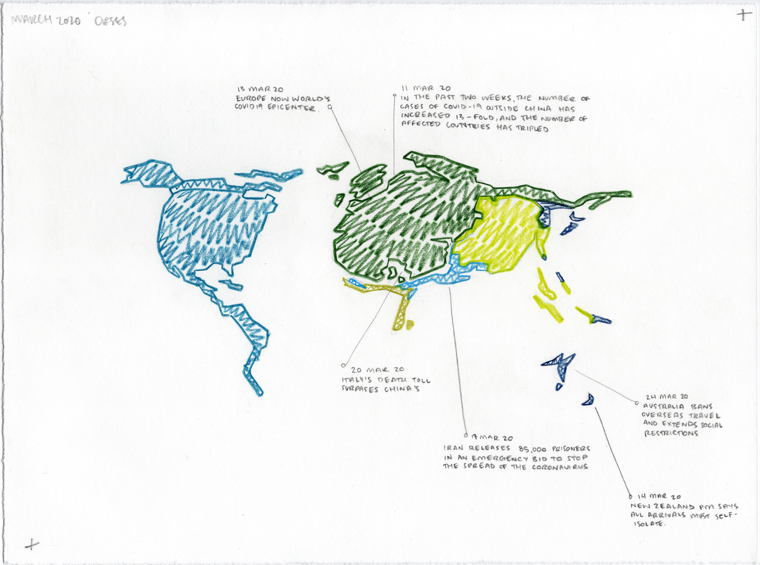
March 2020

April 2020
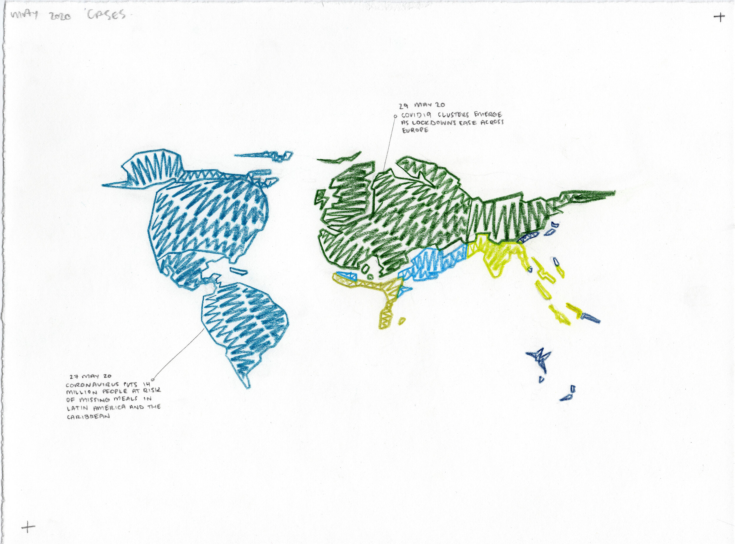
May 2020
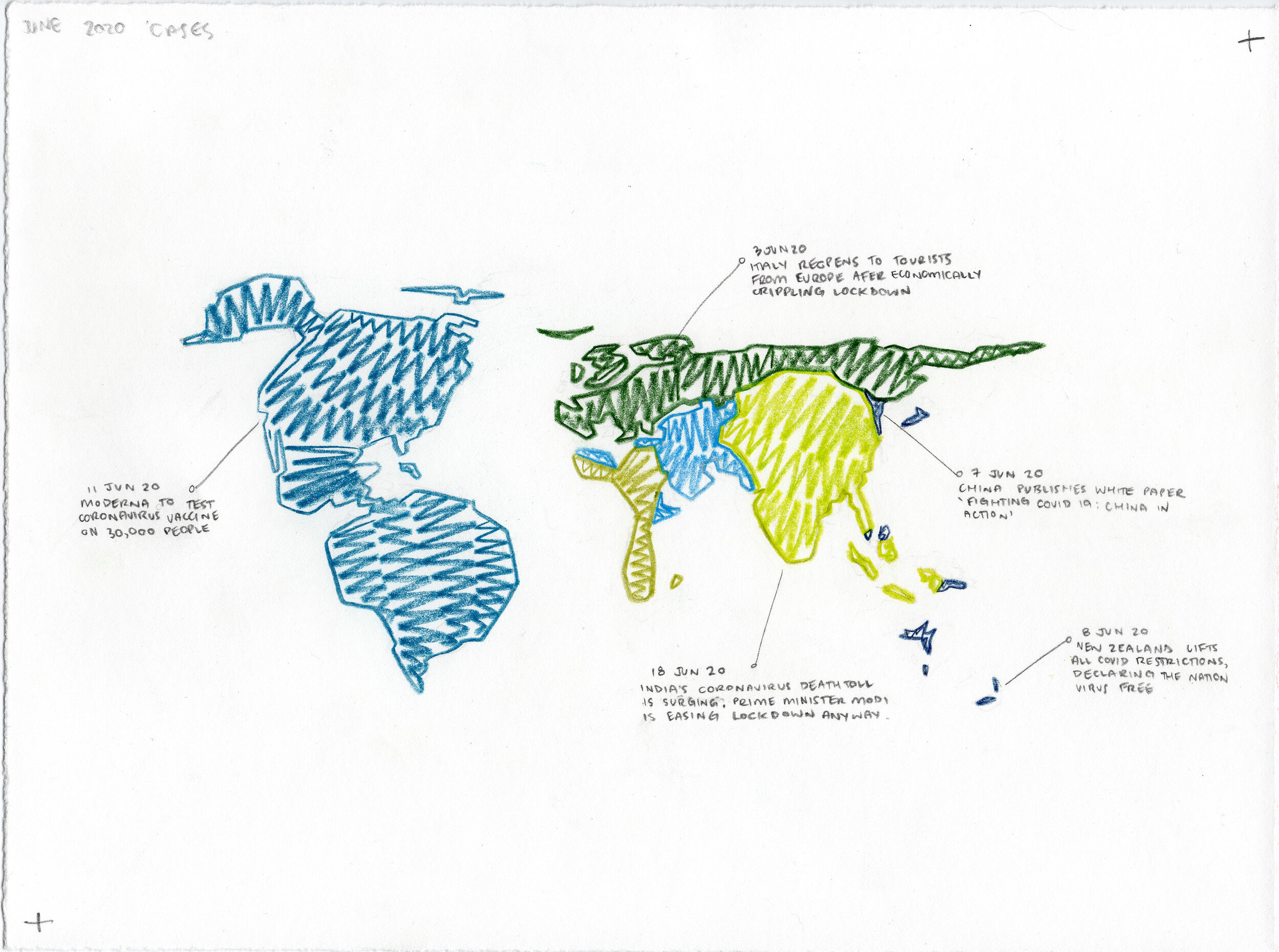
June 2020
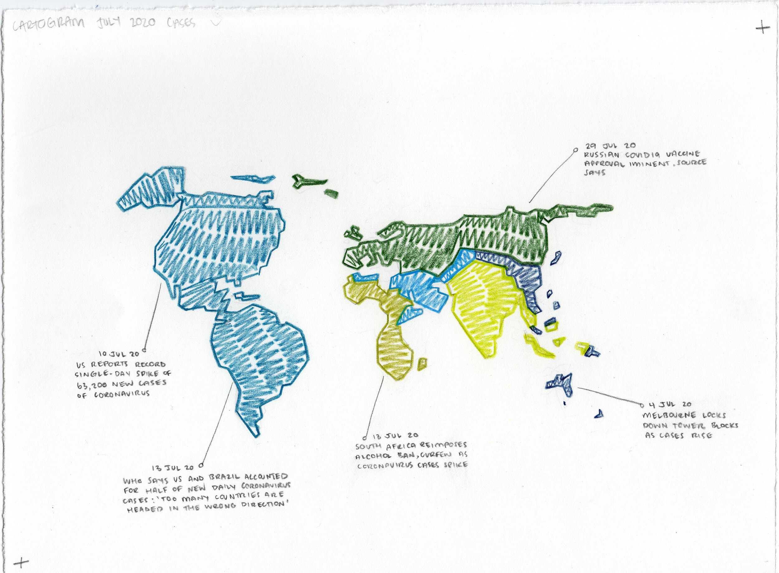
July 2020
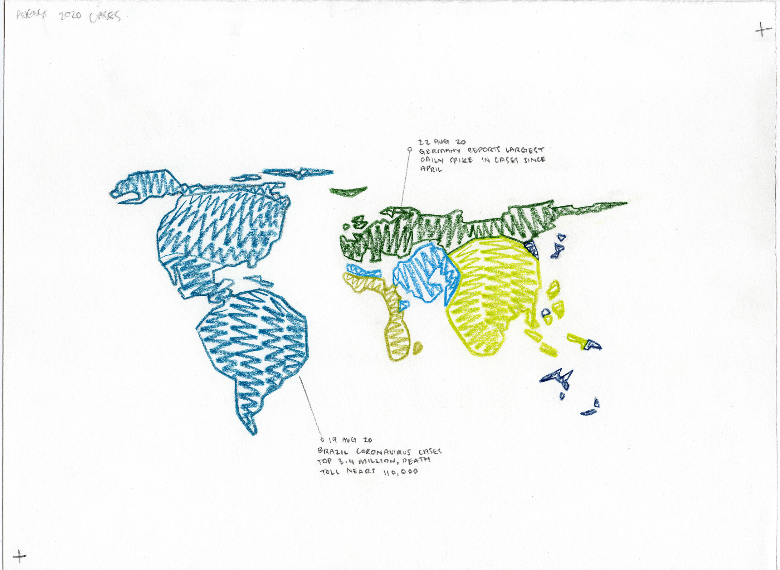
August 2020

September 2020

October 2020

Novemeber 2020

December 2020
The central aim of my project is storytelling through data visualisation with a data humanism approach.
The project, at this stage, serves in part as a proof of concept and in part as a design/install proposal. The work begins with a map telling my personal story of the emerging pandemic. In semester two of 2019 I undertook an international exchange program to the University of Dundee in Scotland. Leading up to the exchange program, in July 2019, I visited the US, Canada and the UK. After concluding my studies in Scotland I toured a lot of Europe, coincidentally many of the countries hardest hit by the pandemic; Italy and Germany, for example, before coming back to Australia via Japan in February 2020.
When thinking about how to tackle this project I considered creating an algorithmic AI interface using complex coding systems that I hadn’t yet grasped or potentially a large scale, site specific, installation work. Ultimately, I went with a medium that I am confident in and comfortable with - drawing! This meant I was able to focus on the story and the overarching themes of the project as opposed to getting bogged down in the nitty gritty of how to code an AI program, for example.
I knew from the start of the semester that I wanted to work with data visualisation for this major project. Along the way we had Andrea Lau of Small Multiples give us what I believed to be a really inspiring presentation, and I came across a data visualisation artist and creative who would play a pivotal role in how I would tackle the project - Giorgia Lupi. Her work My 2020 in Data - So Far and her strongly held belief of data humanism would become fundamental in my ideation process.
Data humanism speaks of using data visualisation to move beyond the simple numbers and instead make data representative of our human nature, a nuanced approach that involves creative new ways of visualisation and moving beyond standard practice. Context is imperative in data humanism and a hand drawn feel can sometimes make all the difference.
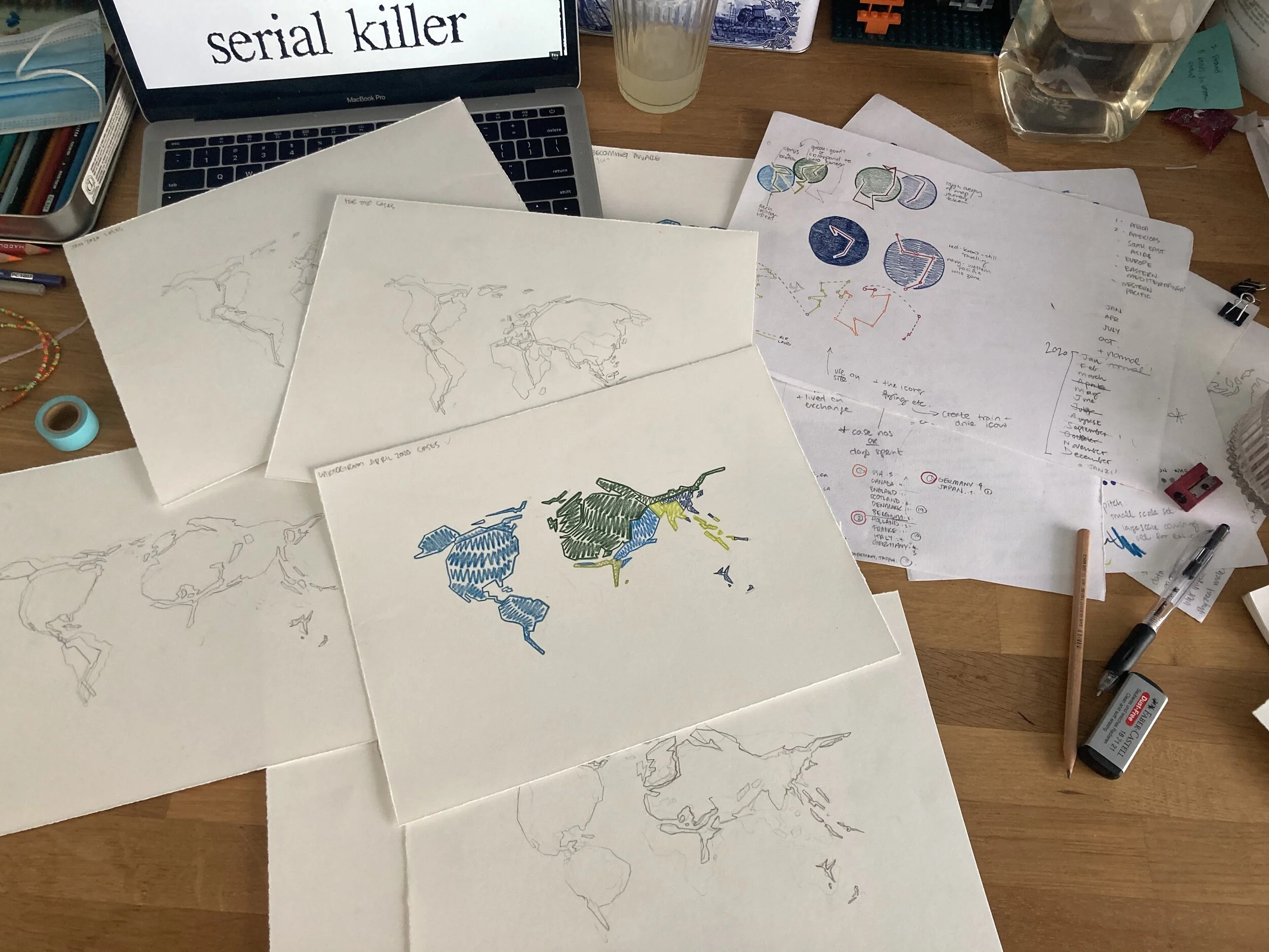
Some light viewing about the psychology of serial killers while working on the project
The core data used to create the cartogram maps was sources from worldmapper.com which uses data from the World Health Organisation to create their own cartograms. Full transparency; I quickly established that I didn’t have the means to extract the data from WHO and visualise it with coding myself so without finding this resource the project would not have been possible.
A cartogram is a type of map where the geographical size of a country is proportionate to a second variable. In this case the second variable is COVID19 cases numbers throughout 2020 which is what I chose to focus on.
March 2020
I went through a fairly typical creative brainstorming process although I will preface this by saying I feel that this is only the beginning of the project and I am looking forward to creating a wider visual ‘suite’ to complement the project.I selected a number of cool, calming colours, blues and greens, to be used throughout the project to pull away from the often clinical data representations we often see in relation to COVID19 data. Lots of the maps often use red to convey case numbers but I didn't want my work to exist in that same framework. The viewer doesn’t need to be reminded of the obvious - that increasing case numbers are bad.
I worked with analogue drawing methods; coloured pencils and lead pencil, to create a hand-drawn, organic feel. The establishment of a unique visual language achieved through textured zig-zag colouring, rigid lines, and handwritten headlines contributes to this effect. The six Individual colours have been selected to reflect what the World Health Organisation identified as the seven regions of the world in their World Health Statistics Annual Report. Namely; these regions are the African region, the America, South East Asian region, European region, East Mediterranean region, and the Western Pacific region.
Early colour variation shown on normal map (without distortion)
I wanted to keep the work relatively simple and easy to understand so minimising the complexity of the map imagery was important to keep in mind. That being said I do believe the work has to be experienced for a moment before being understood as cartograms are obviously not the map of choice in many atlases. I want the headlines and the maps more broadly to prompt discussions about the viewers' experience of the pandemic echoing the central theme of the hundreds of thousands of stories that can be told about the last 12-18 months of life.
